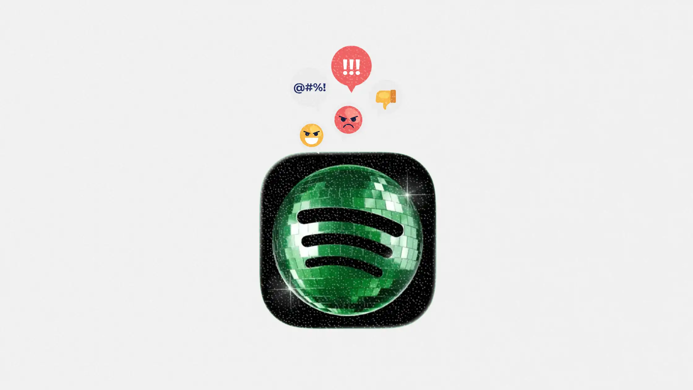
Spotify’s temporary disco-ball app icon sparked a wave of criticism across social media, with users calling the redesign confusing, ugly, and unnecessary. But the backlash may have been exactly the point. The temporary visual change was tied to Spotify’s 20th anniversary campaign, designed to push users toward a nostalgia-focused in-app experience highlighting their listening history, earliest streams, and all-time favorite artists.
For marketers, the reaction is more interesting than the icon itself. Spotify managed to turn a small visual tweak into a viral conversation about brand recognition, platform habits, nostalgia marketing, and audience psychology. Even users who disliked the redesign still opened the app, noticed the anniversary campaign, and talked about Spotify online.
The campaign also highlights a bigger tension in modern branding. Consumers expect familiarity from the apps they use daily, but brands still need ways to disrupt autopilot behavior and create fresh engagement moments. Spotify’s gamble shows how temporary design changes can become marketing assets when they trigger emotional reactions and social discussion.
Table of contents
Jump to each section:
- Why Spotify changed its app icon into a disco ball
- Why the backlash became part of the marketing strategy
- What marketers should learn from Spotify’s nostalgia play
- What this means for app branding and audience behavior
- Why temporary brand disruption is becoming a growth tactic
Why Spotify changed its app icon into a disco ball
Spotify temporarily replaced its familiar green app icon with a glowing disco-ball version as part of its 20th anniversary campaign. The redesign coincided with a mobile-only in-app experience that encouraged users to revisit their streaming history, including their first streamed song, most-played artists, and long-term listening trends.
isn’t she lovely? 💚
— Spotify (@Spotify) May 14, 2026
The company framed the redesign as a short-term celebration rather than a permanent rebrand. Spotify later confirmed on social media that the original icon would return after the anniversary campaign ended.
The reaction online was immediate.
Users across X and other platforms criticized the disco-ball icon for being visually confusing, harder to recognize on mobile home screens, and inconsistent with Spotify’s existing branding. Some users compared it to a blurry or low-quality version of the original logo, while others argued the redesign created usability issues because it resembled a loading indicator.
At the same time, the backlash amplified awareness of Spotify’s anniversary campaign. Discussions about the icon spread rapidly across social platforms, with screenshots, reactions, and memes driving additional visibility for the app.
This is the same psychological territory Spotify already understands through Spotify Wrapped. Nostalgia, personalization, and social sharing create emotional attachment to the platform while reinforcing user loyalty.
Why the backlash became part of the marketing strategy
The most important detail here is that Spotify did not retreat immediately.
Instead, the brand actively engaged with criticism on social media, replying humorously to angry users while repeatedly reminding audiences that the redesign was temporary. That interaction kept the conversation alive longer and transformed criticism into additional campaign reach.
Alright, we know glitter is not for everyone. Our temp glow up ends soon. Your regularly scheduled Spotify icon returns next week.
— Spotify (@Spotify) May 17, 2026
From a marketing perspective, the redesign achieved several goals:
- It interrupted habitual behavior by making users notice the app again.
- It redirected attention toward Spotify’s anniversary experience.
- It generated earned social media engagement.
- It encouraged users to revisit their long-term relationship with the platform.
- It reinforced switching costs by reminding users how much personal data and listening history live inside Spotify.
Several industry observers noted that the icon itself generated more conversation than Spotify’s official campaign messaging.
That matters because attention is now one of the hardest things for brands to earn organically. A temporary visual disruption inside one of the world’s most-used apps instantly became social content.
The strategy also reveals how emotional familiarity shapes digital behavior. Many users interact with Spotify daily without consciously noticing the app icon anymore. By changing something deeply familiar, Spotify forced users out of autopilot.
For marketers, this is a reminder that even small UX or visual changes can trigger disproportionate engagement when they disrupt routines.
What marketers should learn from Spotify’s nostalgia play
Spotify’s campaign offers several practical lessons for brands trying to drive engagement without relying entirely on paid acquisition.
1. Use nostalgia as a retention tool
Spotify’s anniversary campaign worked because it focused on personal history rather than company history.
Users were not celebrating Spotify turning 20 years old. They were revisiting their own memories through music. That emotional framing makes users feel invested in the platform itself.
Brands with long-term customer relationships can apply the same approach through:
- Customer milestone recaps
- Historical usage data visualizations
- Anniversary campaigns tied to user behavior
- Personalized year-in-review experiences
- Loyalty-based storytelling campaigns
2. Temporary disruption can increase visibility
The icon redesign shows that brands do not always need universally positive reactions to succeed.
Temporary disruption can work when:
- The brand remains recognizable
- The change is reversible
- The campaign has a clear narrative purpose
- The audience already has strong brand familiarity
Spotify could afford to experiment because users instantly knew the app belonged to Spotify. Smaller brands should be more cautious because recognition thresholds are lower.
3. Social backlash can still create marketing value
Not every negative reaction damages a campaign.
In Spotify’s case, criticism actually expanded reach and increased campaign awareness. The company leaned into the conversation instead of defensively shutting it down.
That said, this only works when:
- The controversy remains low risk
- The product experience is unaffected
- The backlash is emotional rather than ethical
- The audience understands the change is temporary
There is a major difference between “this logo is ugly” and a controversy involving privacy, trust, or platform safety.
What this means for app branding and audience behavior
The Spotify situation highlights how emotionally attached users become to visual consistency inside digital ecosystems.
App icons are no longer passive brand assets. They function as behavioral shortcuts.
Users rely on instant recognition patterns to navigate their phones quickly. Even minor visual changes can create friction because they interrupt subconscious habits.
For app marketers and product teams, this creates an interesting balancing act:
- Familiarity improves usability and trust.
- Novelty increases attention and engagement.
- Too much disruption risks frustration.
- Too little evolution risks invisibility.
Spotify intentionally pushed against that tension.
The company likely understood that users would react strongly because the app icon is viewed constantly throughout the day. That visibility made the redesign far more powerful than a traditional campaign banner or in-app notification.
It also demonstrates how branding decisions increasingly function as product experiences rather than just visual identity updates.
 Patrecia Meliana
Why temporary brand disruption is becoming a growth tactic
Spotify’s disco-ball icon may ultimately be remembered less as a design decision and more as an attention strategy.
Modern audiences are overwhelmed with content, notifications, and marketing messages. Temporary brand disruptions create moments that break routine behavior and trigger emotional responses.
We are likely to see more brands experiment with:
- Temporary app redesigns
- Interactive visual campaigns
- Nostalgia-driven product experiences
- Limited-time UX changes
- Social-first brand activations
The challenge will be balancing disruption with usability.
Spotify succeeded because the redesign was temporary, culturally aligned with the anniversary campaign, and emotionally connected to users’ listening history. Even the backlash reinforced visibility.
For marketers, the larger lesson is clear: attention often comes from interrupting familiarity. The brands that understand how to do that without damaging trust will continue to dominate digital engagement.