Most brand-monitoring tools do one job well: they tell you something happened. What happens next is usually left to whoever has the time to dig through the feed, figure out what matters, and decide what to do about it. Often, nobody does.
A June 2026 Gartner survey of 426 senior marketing leaders found 84% of companies stuck in what Gartner calls a “brand doom loop.” The pattern is simple and brutal: weak measurement makes the budget hard to defend, the budget shrinks, and the measurement gets weaker still. Round and round.
dig, a platform that tracks how brands get talked about across social video, is trying to build past the alert stage. Two of its enterprise customers recently got a custom tool built around their own data in under a week. Neither needed an engineer. Nobody collected new data or built a new model. The company took information it already had and found a faster way to shape it around how each customer actually works day to day.
Ofer Familier, CEO and co-founder of dig, put the real problem more narrowly than most vendors do: his teams often already have the signal a customer needs. The hard part is handing it over in a shape that matches how that customer actually makes decisions.
On September 16, dig announced a framework, built with Lovable, meant to close that gap. It turns a recurring customer question into its own purpose-built app, sitting on top of dig’s existing intelligence engine, covering brand health, influencer discovery, crisis response, product comparisons, narrative tracking, and campaign analysis.
Table of contents
- When the data was already there, but nobody could use it
- A map, not a dashboard, is what actually changed things
- Moving fast still needs one set of rules underneath
- A 95% accuracy number on the box doesn’t mean what you think
- What this actually means for a marketing team
When the data was already there, but nobody could use it
Ofer’s first point cuts against the usual pitch. Nobody rebuilt the intelligence layer for either customer.
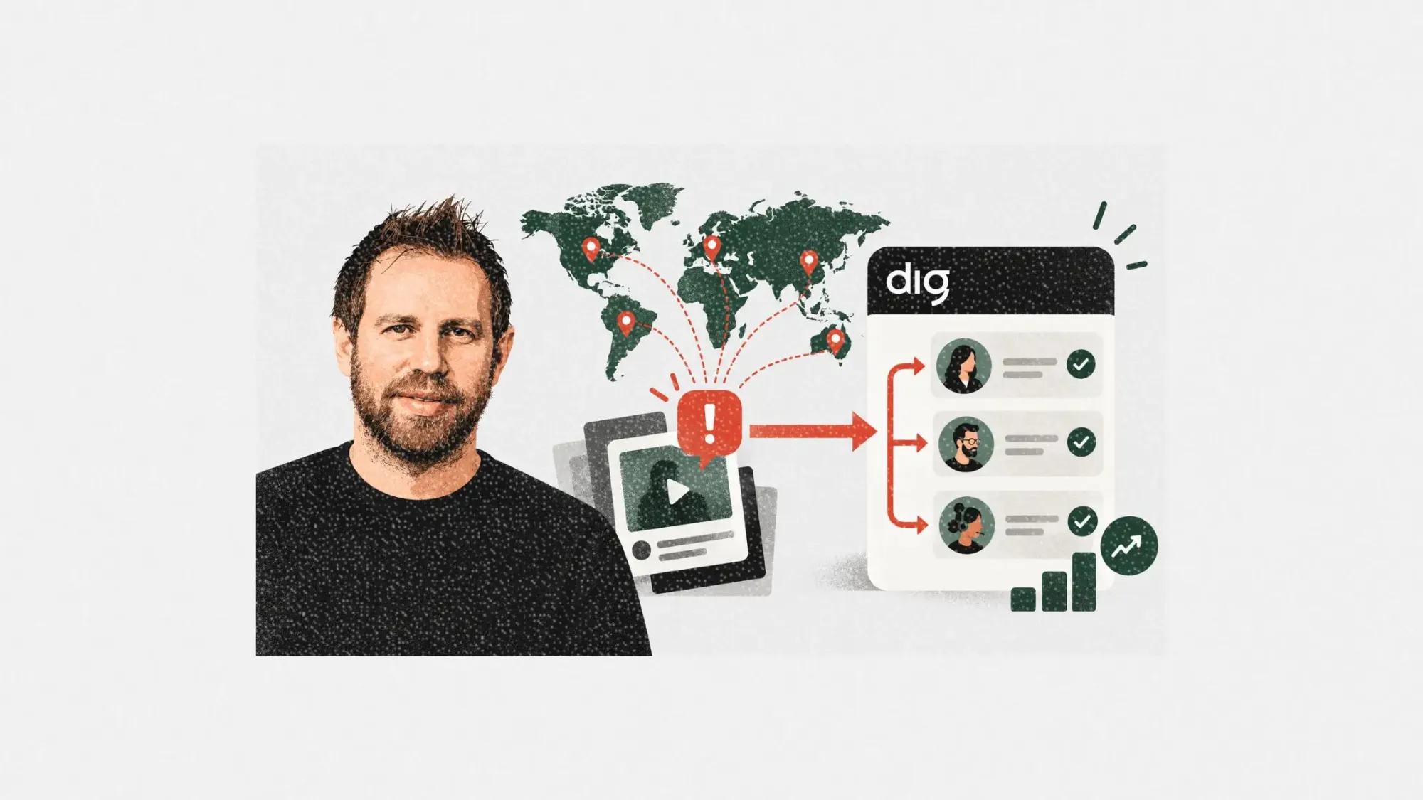
One build was a map with automated workflows for a global luxury retail group. The other was a dashboard covering a fashion house’s whole brand portfolio. dig already had the underlying data for both. What Lovable added was the front end, wrapped around data that already existed. Both went live in under a week, and, as Ofer put it, “neither one touched engineering at all.”
That’s a smaller claim than “engineering disappeared,” and worth being precise about. dig still owns the intelligence engine, the data pipeline, the whole system underneath. What changed is who gets to shape the last stretch, the part between the raw signal and the screen someone actually looks at when deciding what to do next.
A map, not a dashboard, is what actually changed things
The retail example is the clearest proof that the bottleneck was never the data.
The location tagging and prioritization already existed inside dig. The problem was that a marketing or comms team can’t act on a signal buried in a feed of undifferentiated alerts. Before the new app, Ofer said, the retailer got a constant stream of notifications with no way to tell which ones actually mattered. Its customer-service team usually only found out about a problem once it had already turned into a real complaint.
The app now puts every property on a world map with a live status. Click a flagged issue and it links straight to the video that set it off. Notifications route by property, and they escalate on their own if nobody responds in time.
That turns a vague question, “what’s happening on social right now,” into a specific one a marketer can actually work with: which property needs someone right now, who should respond, and what clip triggered it.
Ofer described two more examples along the same lines, though he couldn’t name either customer. One caught a leaked product online and pulled it offline within hours. Another, a fashion brand, noticed an influencer had a bad in-store experience and reached out before it became a bigger story.
Moving fast still needs one set of rules underneath
Building interfaces this quickly raises an obvious question for anyone who’s been burned by a tool that drifted: does every customer end up with a slightly different version of the truth?
Ofer said dig limits that by keeping every app on the same underlying engine, then running every version through the same automated checks. “We check data consistency, UI behavior, and infrastructure stability on every version,” he said.
dig also shared a quote from Lauren Rhode, Head of Revenue at Lovable. She said Lovable exists to let the person closest to a problem actually act on it, and described dig’s use of the platform as removing the technical wall between an idea and something that works.
That framing draws a useful line for anyone evaluating this kind of setup. Lovable builds the interface layer. dig still owns and is accountable for the intelligence sitting underneath it. Knowing which vendor owns what matters more once things break.
A 95% accuracy number on the box doesn’t mean what you think
This is the part marketers evaluating any intelligence tool should read twice.
dig’s website states 95% accuracy for its video analysis and more than 90% coverage of social video. Asked how a platform-wide number becomes something a customer can trust for one specific job, Ofer said every app runs on the same infrastructure and therefore inherits the same performance and accuracy.
That’s an answer about inheritance, not a new, use-case-specific guarantee. A crisis-response tool might run on the exact same engine as a broad monitoring dashboard, but missing one real crisis costs far more than missing one routine mention. The acceptable margin for error isn’t the same job to job, even if the underlying engine is identical.
Anyone evaluating a tool like this should ask three follow-up questions before buying: how was that accuracy number actually measured, what content and languages were included in the test, and is your specific workflow tested against its own bar, or just assumed to inherit the platform average.
What this actually means for a marketing team
Go back to that 84% figure from Gartner. Most brand teams aren’t failing because they lack signal. They’re failing because nobody built the last mile between the signal and the person who has to act on it, and a raw dashboard doesn’t fix that on its own.
Most social-listening tools ask the customer to adjust to a fixed dashboard. dig’s bet is the opposite: keep the intelligence engine consistent, then rebuild the interface and the escalation rules around how the customer’s team already operates.
The retail map makes the point concrete. The data wasn’t new. It became useful the moment properties, source videos, who gets notified, and when things escalate all got stitched into one workflow instead of sitting as scattered alerts nobody had time to sort through.
Before buying into any brand-intelligence tool, the real test isn’t the accuracy number on the landing page. It’s this: once the system spots something, how many manual steps stand between that alert and the person who can actually do something about it? If the answer is more than one or two, the doom loop isn’t broken. It’s just been given a nicer dashboard.